Research-driven design
Public roadmap improvements
The Cloud Roadmap is where Atlassian informs customers about upcoming Cloud features. It’s an important source of information for organizations who are deciding whether to move their on-premise software to Cloud.
Audience:
Solution:

Atlassian customers who are considering migrating from on-premise to Cloud
Challenge:
As a business, we need to increase Cloud migrations to meet our company goals.
As a user, I’m struggling to find what I need on the Atlassian website, so I can’t make a decision.
Take a research-informed approach to redesign the roadmap, helping our customers find accurate, timely information.
My role:
UX research and content strategy lead
My process
Background
When I joined the team, I inherited a collection of user research about the Cloud Roadmap, which found the following problem areas:
Roadmap items weren’t informative enough, so customers had to go searching for more details
The roadmap was challenging to navigate and filter, so customers missed crucial information
Customers weren't notified when the roadmap was updated, which prevented them from making timely decisions
Customers couldn't easily share roadmap items with their teams, making it harder to build the case for Cloud
With this information and usage data from ContentSquare, my team made a plan to address these problems, starting with the page layout and filters.
Card sort
We knew that users had trouble with the current roadmap filters, but we had to learn why and how we could improve it. To understand this, I designed and conducted a moderated card sort. Our participants were on-premise Atlassian customers who evaluate and implement software for their company.
Research goals:
Learn about our target audience’s mental model for finding relevant information
Identify the ideal taxonomy for Cloud Roadmap items
Key findings:
Too many options = decision paralysis. Our customers were having a hard time finding the right information because there were too many choices, many of which seemed redundant.
Our terminology was unclear. We were using internal jargon that customers —especially less-technical folks— weren’t familiar with. Not only did this cause confusion, it made customers feel like our products aren’t approachable.
Our filters weren’t comprehensive. Customers wanted to filter the roadmap based on plan and geographic availability.
Content strategy & usability updates
Using these findings, I partnered with my team’s product designer to update the roadmap.
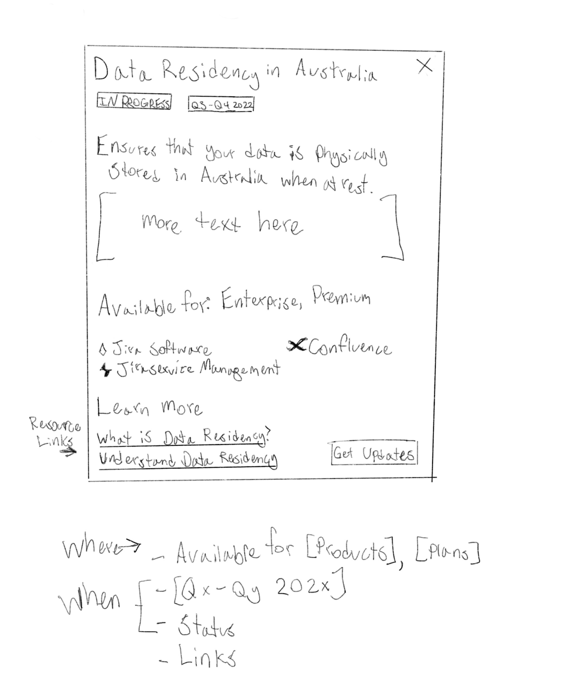
I developed a new taxonomy, updated the terminology, and consolidated redundant filters
To increase usability, we moved the filters to a sticky location at the top of the page
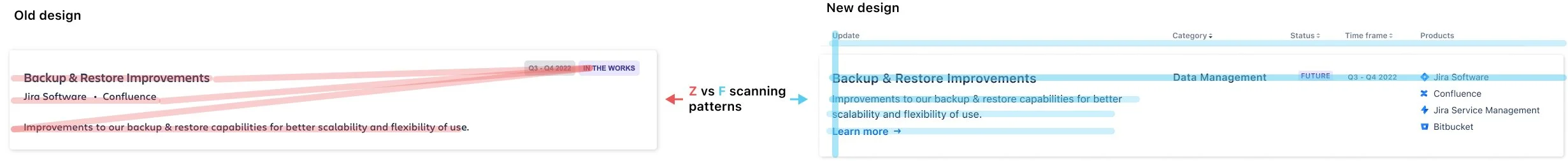
I updated the information architecture to improve readability and consistency
Before

Usability testing
Reorganized card content
Before launching our redesign, we needed to ensure that we were addressing users’ needs. I designed and facilitated a moderated usability test with five participants, asking them to complete three tasks on the roadmap.
All participants were able to complete the tasks without help. In the process, we learned that customers wanted to be notified when the roadmap was updated and to easily share specific items on the roadmap with their stakeholders.
‘Share’ feature
Based on user feedback, our next iteration was making each item on the roadmap shareable. For technical feasibility, each card needed to have a unique URL. After exploring a few options, I drew an idea for a modal, created a lo-fi in Figma, and then worked with a product designer to bring it to life.
Content strategy
‘Subscribe’ feature & email template


The Cloud Roadmap is maintained by our go-to-market team, in partnership with technical teams throughout Atlassian. With so many people creating content for the roadmap, it needed some lightweight content standards to maintain consistency.
After


Finally, we worked on a “subscribe” feature for the roadmap. Along the way, we ran into many technical constraints, which we worked through with our engineering team. Long story short, we decided to create a full-roadmap email subscription. This solved the basic user need—knowing when the roadmap gets updated—while being feasible for our team.
I worked with my product designer to add the subscription UI to the roadmap. I also collaborated with the email operations team to create an email template for our marketing team to use for the quarterly emails.

Impact

Increased page engagement: The percentage of engaged page visitors increased by 26%, with 20% of page visitors using the Share feature.
Improved content quality: Based on customer feedback, the content and taxonomy improvements helped customers find what they need.
Influenced cloud migration strategy. Over 20k customers subscribed to the cloud roadmap within one year, making it a key touchpoint for customers who are considering a cloud migration. The subscription feature was also highlighted in Atlassian's quarterly shareholder report.
Updated filter taxonomy
